New smart app that helps visitors navigate in the park
UX and UI design
Castle Park -smart navigation app for an amusement park
Overview
Do you feel like you're in a maze when you go to an amusement park? You aren't alone!
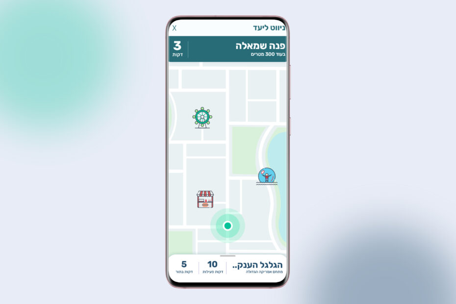
Castle Park offers you an easy navigation app for the park that guides you to the nearest attractions with the shortest lines, all based on your group's needs and preferences!
The app offers 2 modes: auto-drive and self-drive
UX goals
Create an easy to use navigation app for the park, which combines live data (wait time and proximity of the attraction), to enhance the park-goers experience by minimizing wasted time
The problem
Navigation in the park via paper map is no simple task and people spend a lot of time looking for their next stop without knowing if the attraction aligns with their preferences
These are the main groups of users
In the login screen users will update their details (height, what they want to eat, what scares them, etc.) and the app will become personalized to them

Friends
Visiting for 1-2 days, 3-7 members, spend up to half an hour understanding paper map

Family
Visiting for one day, parents with 2-4 kids, have a hard time choosing where to eat

Guided Group
Visiting for one day, 2-5 people, can waste up to an hour waiting in line
User journey
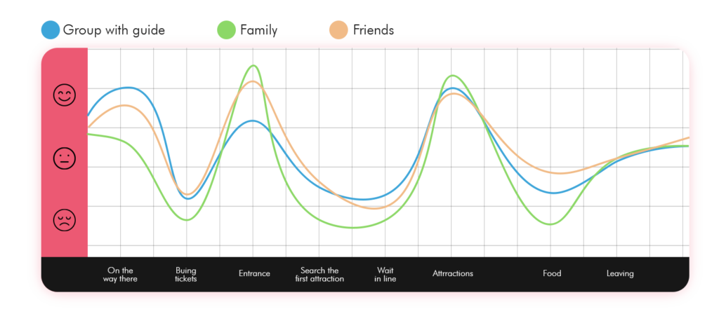
Conclusions
There are three main causes of frustration (pain points): buying tickets, navigating the park, and finding something to eat
Pain points
Food
Hard to find one restaurant everyone enjoys
Waiting in Line
Up to an hour spent in line
Navigation
Hard to find the next attraction
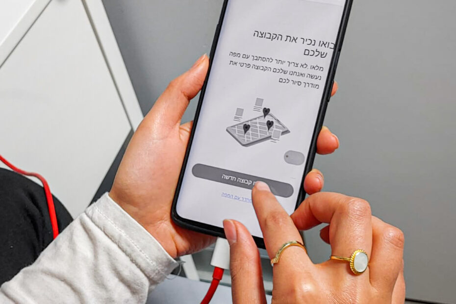
Let's meet the group!
Lightning-fast sign up and group creation that's easy to follow, all while being considerate of environmental factors that may interfere with the process (like glare from the sun)
Let's get to know you personally
Now the app will ask the user to update each member's preferences so it can determine which attractions are relevant to the group
You're ready to go!
After everything is set, the users can start their trip in the park with the auto-driver
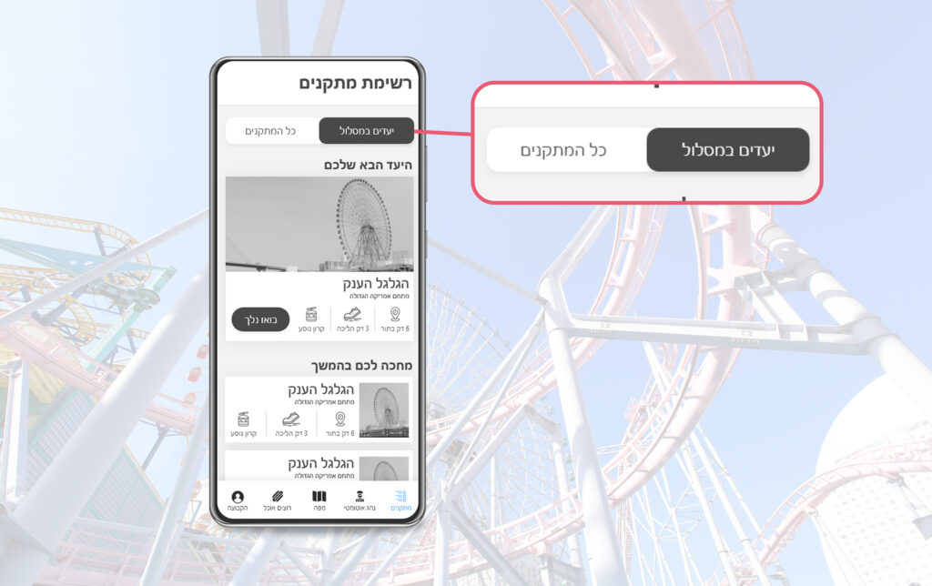
This is your first attraction
In this card, users can read about the next stop in the trip and start the navigation there
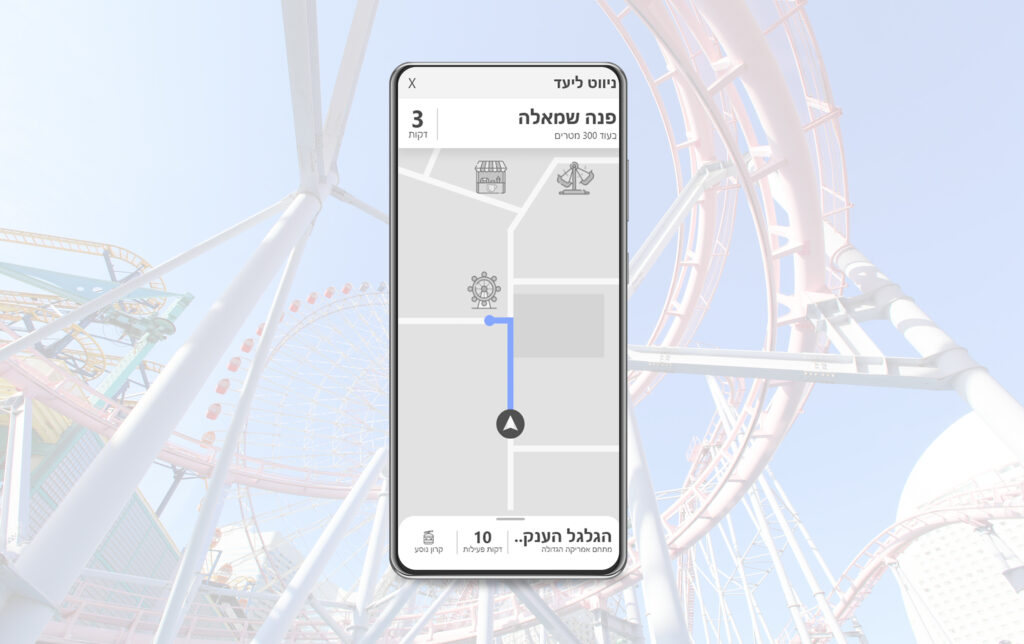
Easy to reach the destination
The user confirm that he want to go to the destination and the auto driver starts the navigation mood
Choose your plan
Meet the app's attractions screen! Here users can see the auto-driver's next stop along with further attractions in the park
UI Deisgn
After I created the UX wirframs, I create the UI design

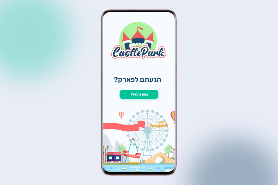
Splash screen
Colorfull and fun splash screen that match to the park environment
Map customization
Custom map that includes the brand colors
