EL-AL is the national airline of Israel. I saw their website and found some UX mistakes, so I decided to re-design it.
The Problem
There are missing lables that make the website inapprehensible. There are also issues with language and localization
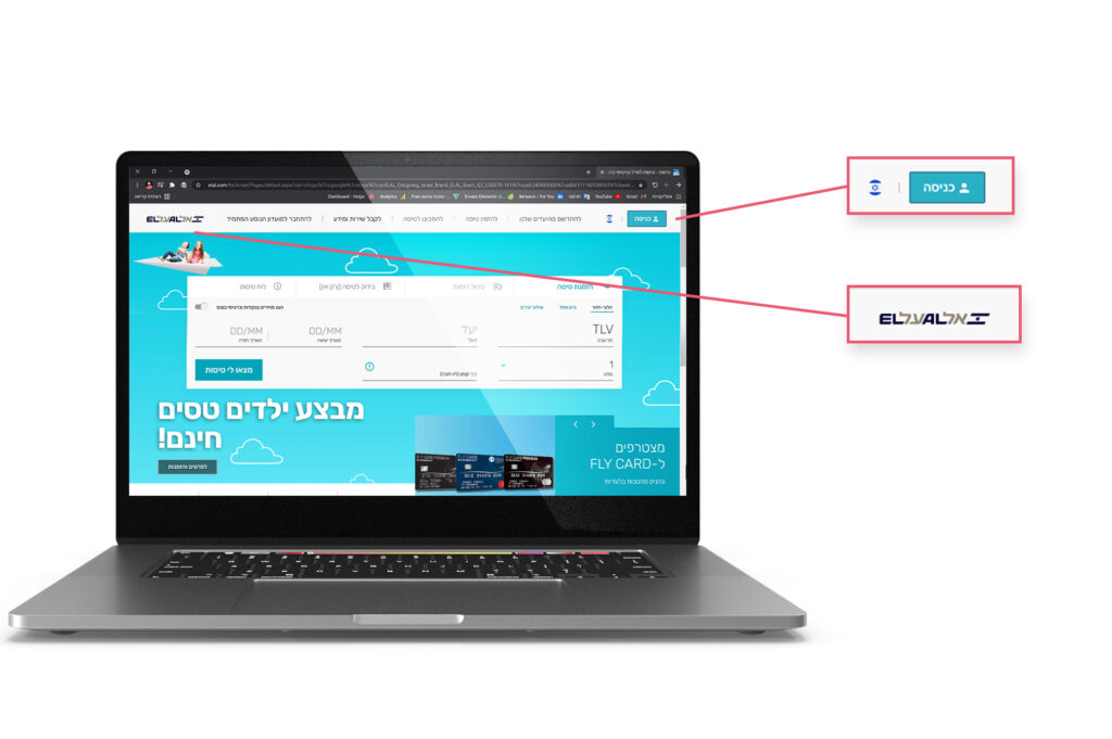
Language Issue
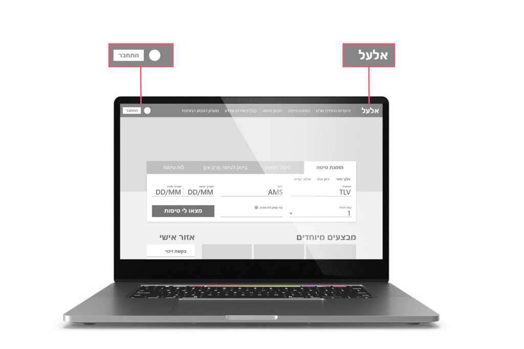
The header fits the English based site, but not the Hebrew based
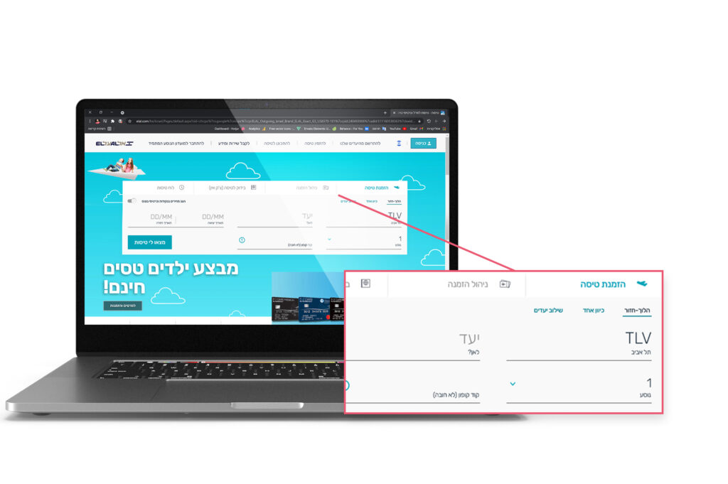
Tabs are not clear
The tabs in the booking section are not clear enough and the user can barely understand what category they’re in
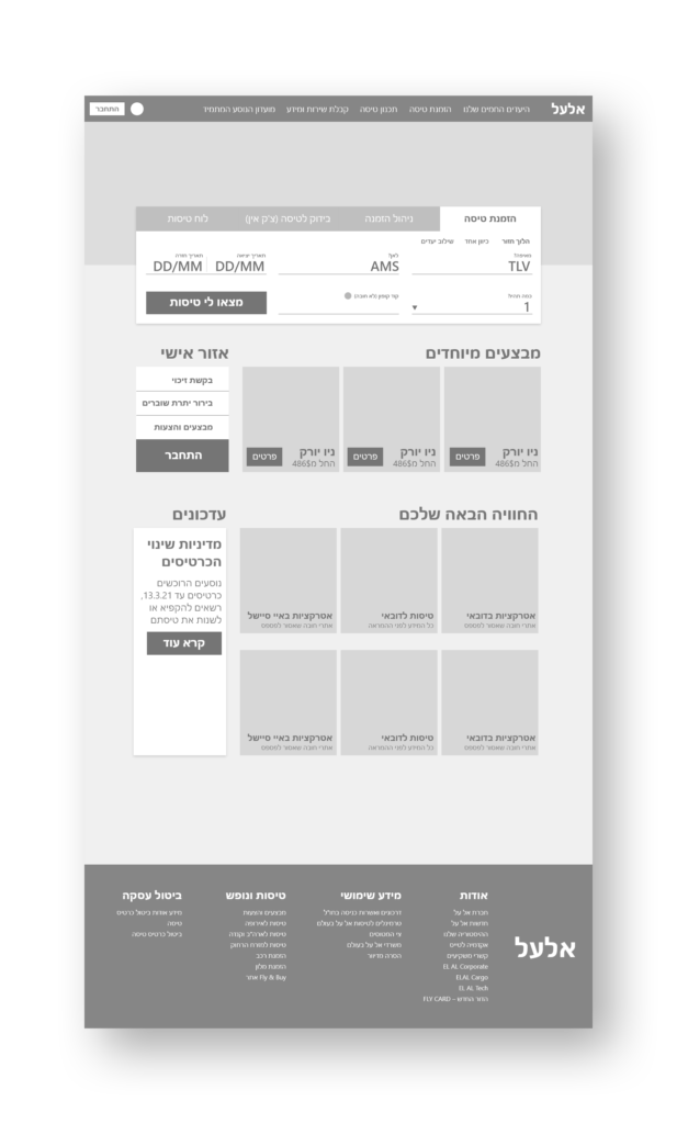
Where am I?
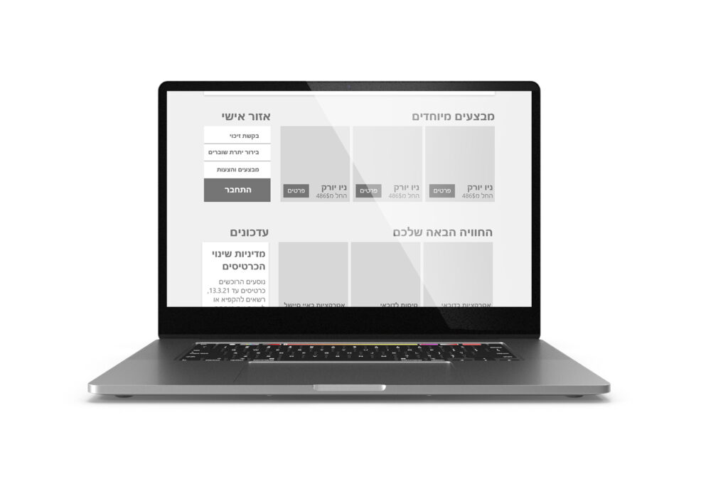
All over the website, there are many flow mistakes that result from language issues and the many missing titles. These things made the flow of the site complicated and unclear, as you can clearly see from this screenshot
So what I decided to do
After a deep look, i decided to fix two things to help the site flow better
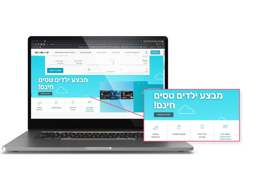
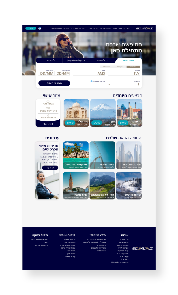
Lables and bounded areas
I added clear separations between every section of the site to improve the
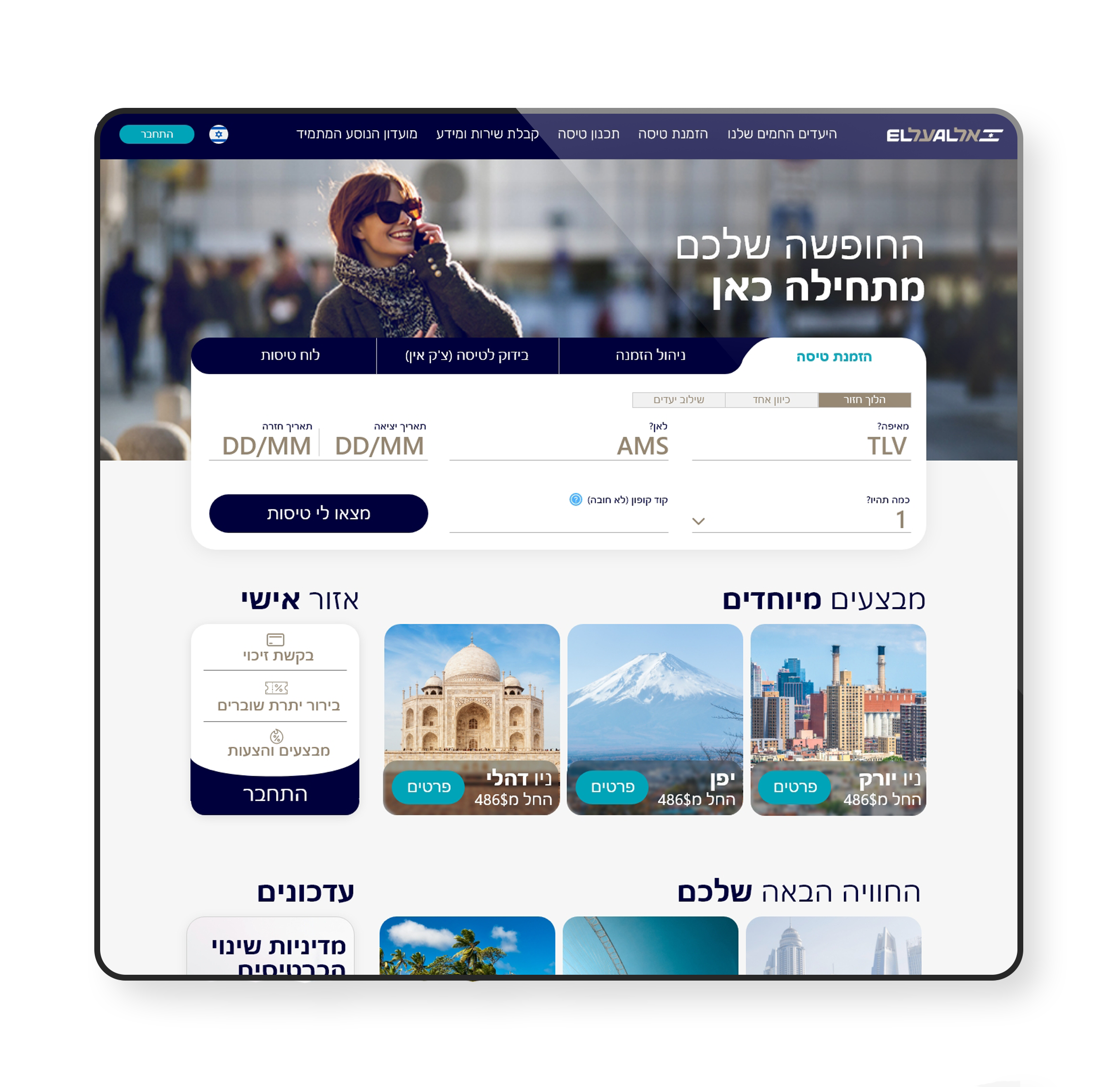
Language Issues
I saw many language issues so I decided to fix many of them by making the entire site read from right to left
Now it's an Israeli site
Now the logo and "Log-in" button are in the right place like they should be.
In addition I created clear tabs with contrast to make sure that users know which tab they’re looking at
There are sections!
I created very clear sections with titles and borders to make sure the site is very easy to use, and make it clear for first time users
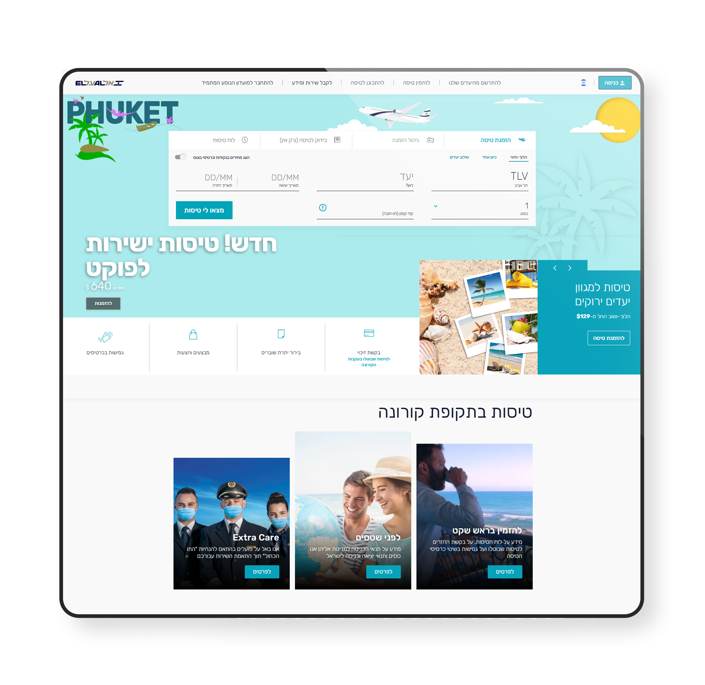
What about colors?
After redesigning the UX, it was time to add some colors and create the new UI for the site according to the brand identity and colors
After UI
Before UI
This is the before and after
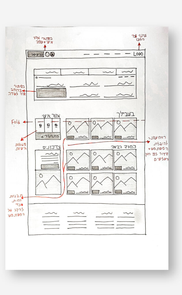
From sketch to final result
Here is the whole process, from the sketch step to the final result