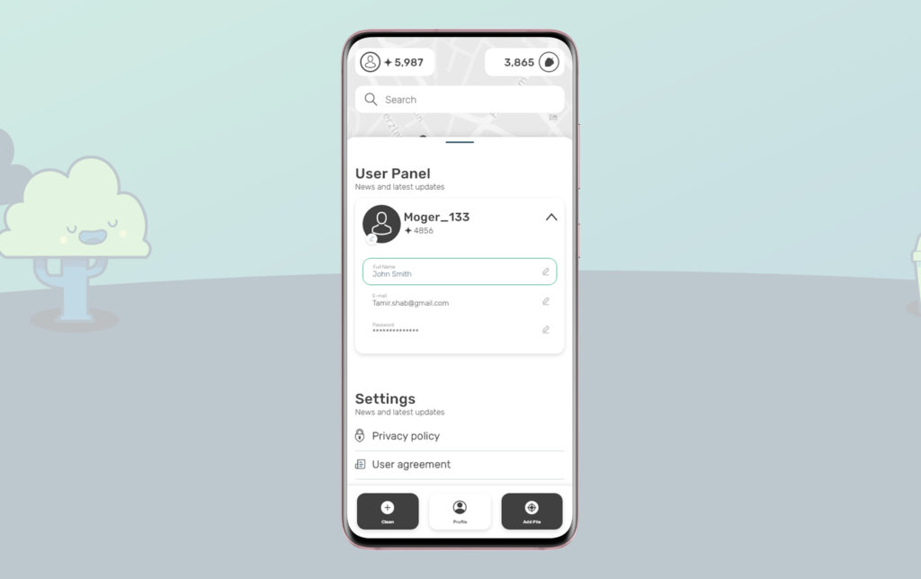
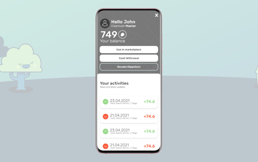
Account
Account and bank screens

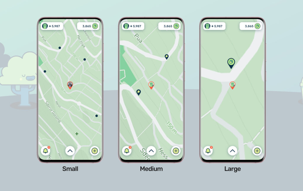
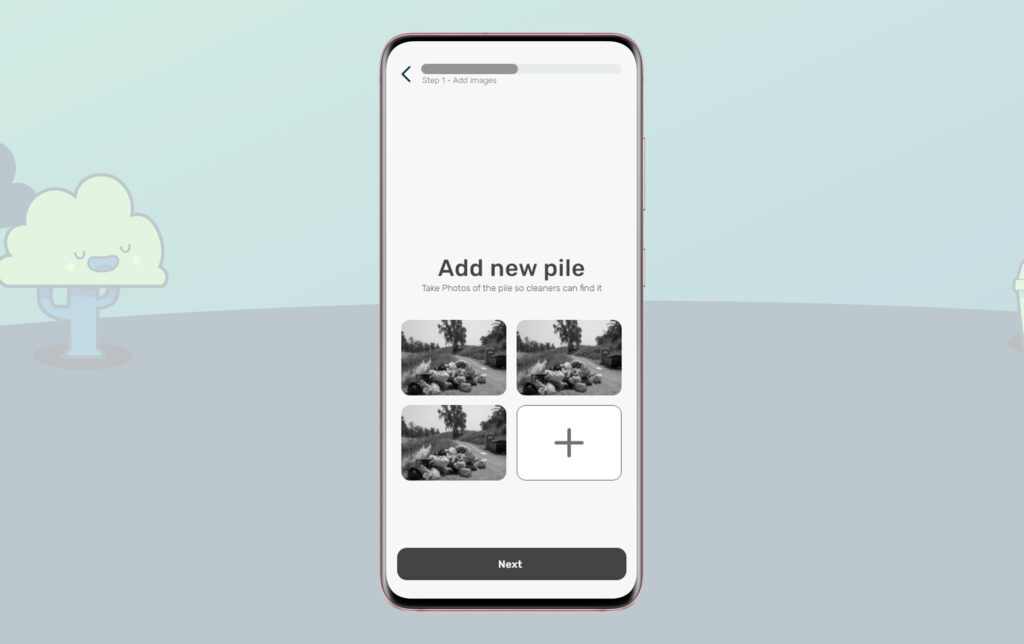
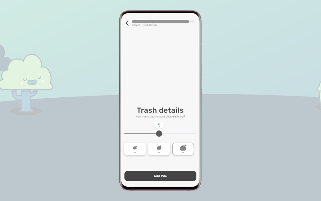
Add a new pile
New pile marking process
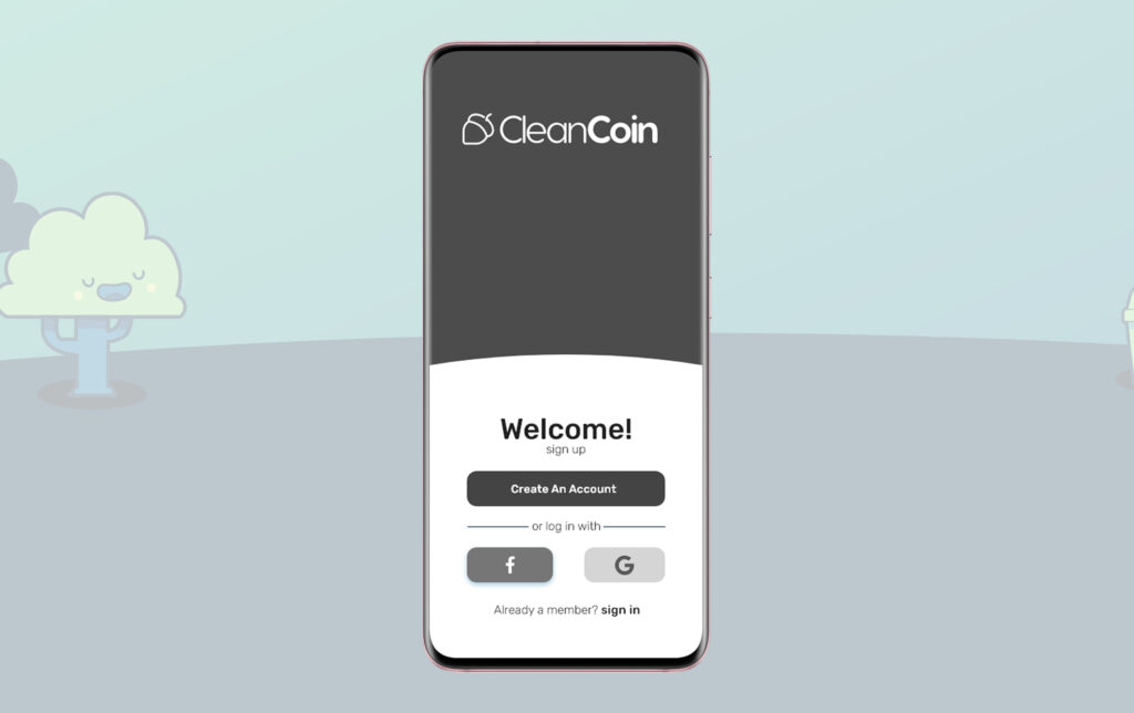
Welcome!
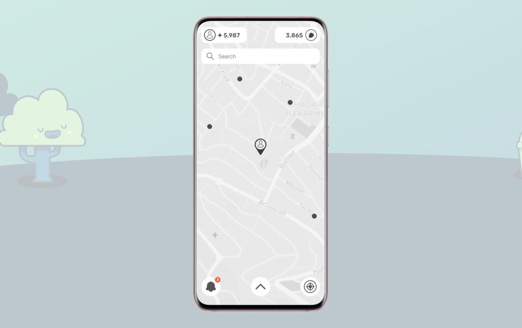
On boarding screen and main screen

Account
Account and bank screens
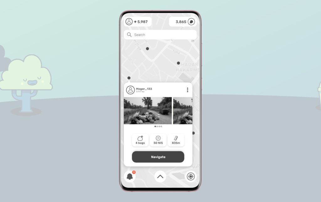
Add a new pile or clean one
New pile marking process and clean exists pile

Welcome!
On boarding screen and main screen
Account
Account and bank screens
Add a new pile or clean one
New pile marking process and clean exists pile
Welcome!
On boarding screen and main screen